Brite Mobile App
Team Members:
Jane Ugrinovskiy (UX)
Yi Liu (UX)
Bonnie Lawrence (Visual)
My Contribution:
Ideation, Research, Wireframes (Sketch), Prototype (Invision)
Time Frame:
2 weeks (July 2016)
The Ask
Sapient Consulting came to our creative team with a request for an energy mobile app. They needed an iOS app that could be sold to energy providers, like Eversource and Duke, for their users to connect with their account. This would allow users to perform various functions, like paying their bill, but also help them to really understand their energy consumption.
The Problem Space
While energy has traditionally been a regulated market without any user choice, that is now changing. In many parts of the United States, consumers now have the opportunity to choose their energy provider. This opens up many new possibilities in customer experience in the energy space.
In the past, these energy providers have had little incentive to provide their users with quality user experience. Now this can be what differentiates them from their competitors. Currently, it is a challenge to perform simple tasks, like bill payment on many provider's websites.
However, basic functionality was not our only goal. Similar to the boom in financial apps in the last few years, there is a lot of room in the energy space to help users understand how they're consuming energy and easy ways they can save money.
Deliverables
After two weeks, we had a visual prototype that Sapient Consulting could take on pitches to energy providers.
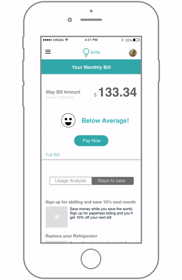
The video showcases all of the interactions, including the registration flow, looking a summary of your bill, paying your bill, and viewing your usage by month and application. If you wish to click through the prototype, you can access an Invision prototype here.
The password for both the video and the prototype is "brite".
Research
Prior to this project, Sapient had put together a series of research with another team. We spent about a day and a half at the beginning of our timeline going through all of their research and materials, as well as looking through the deliverables they put together, including a short video of a user journey. This gave us a strong foothold moving forward.
The rest of our research was done throughout ideation. Everyone on the team brought in a copy of their energy bill so we understood how current companies are showing information to their customers. We also did a quick comparative analysis of how popular financial apps, like Mint, Personal Capital, and Chase, explain complicated information to their users.
From our research we found that the way energy companies present data to users is both dense and not actionable. Overwhelmingly, users want to consume less energy, either to lower their carbon footprint or simply save themselves money. These are strong motivators, but the information their energy companies doesn't help them learn how to change their behavior. Laying out data clearly and giving the users actionable tasks were our main focus and drove our decision making throughout the design process.
Our Process

The time frame we had to both design and build a prototype was very small. We chose to work in Sketch because it allowed us to create wireframes as well as visual design with one tool. The three UX designers took ownership of the different pages and created wireframes that we handed off to the visual designer.
While we all helped one another whiteboard through various concepts, I took ownership of the Registration flow, the Bill Summary page, the Ways to Save page, as well as a Plan Overview page that did not make it into the final deliverable.